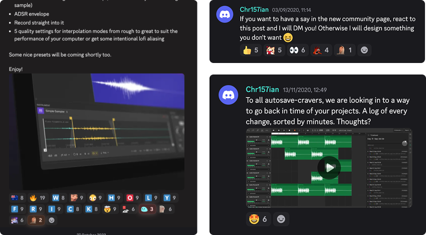
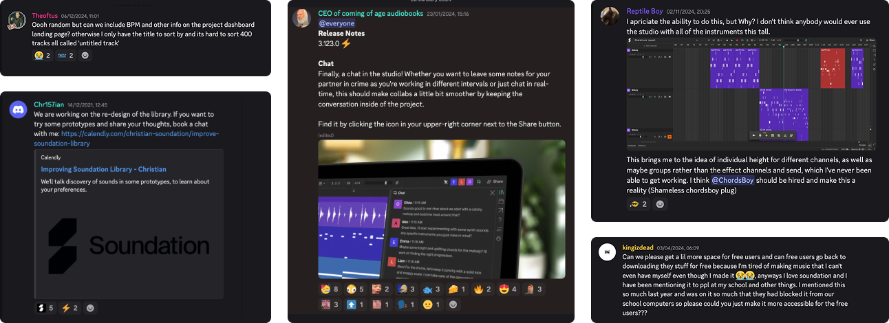
Working in a small team of 10 people, for a community of +50,000 monthly users was great. Many of the users were heavily engaged in the product through forums, polls and conversations. Our target group consisted to 50% of young makers (13-17). Hearing them talk about "roadmaps" and "priorities" was a bit mind-blowing.
But the learning curve for creative tools can be steep. We knew that users who stayed for +5h had a 80% higher probability of becoming paid customers. Therefore, my priority was often to talk to hobby music producers who wasn't already familiar with the product. Reducing friction in the early stage was crucial to get the users onboard and turn them in to paying customers.
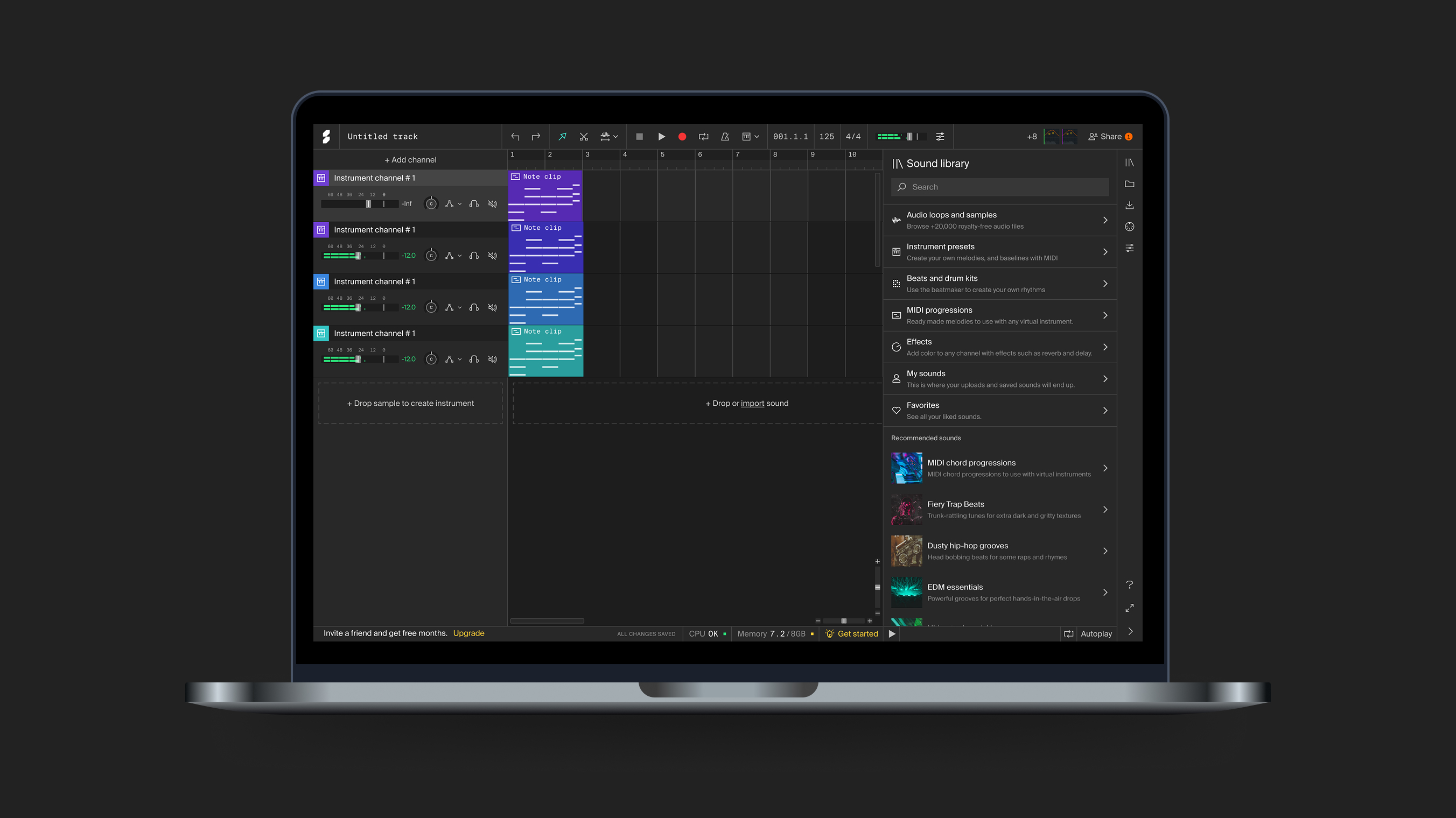
Over the years I designed and shipped numerous features, guided by our knowledge our users & product strategy. Sophisticated virtual instruments, collaborative functions & SEO-crucial web design went through design discovery, testing, QA, implementation & iteration.
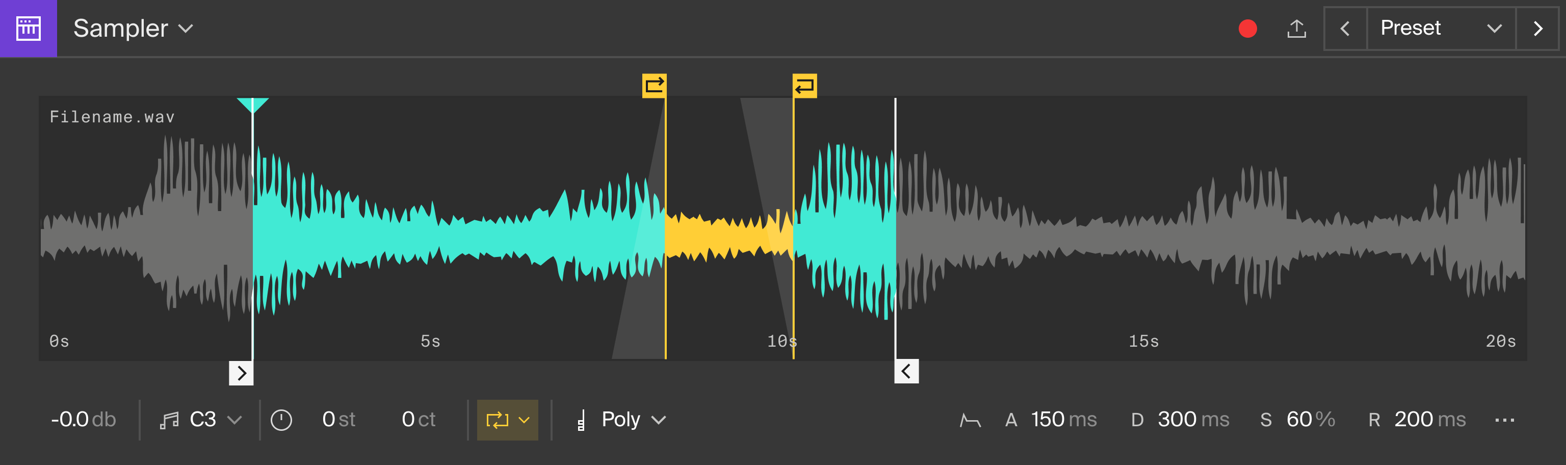
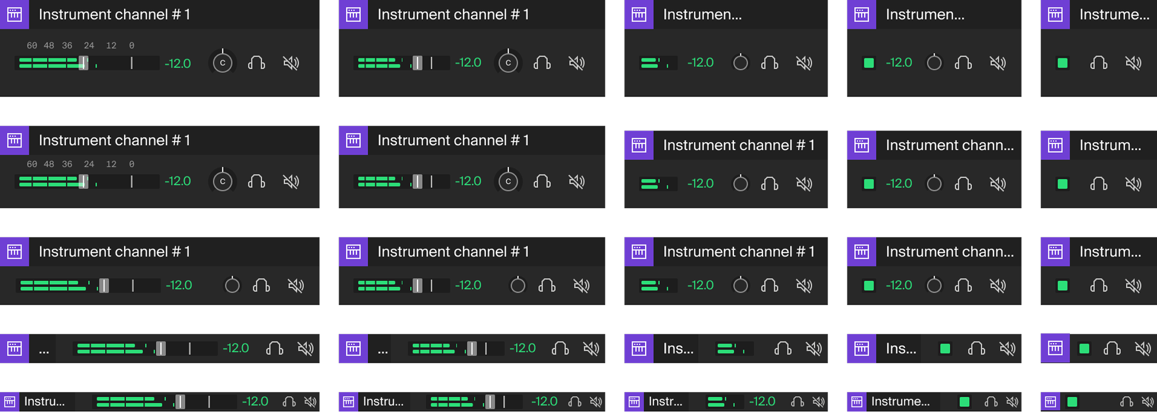
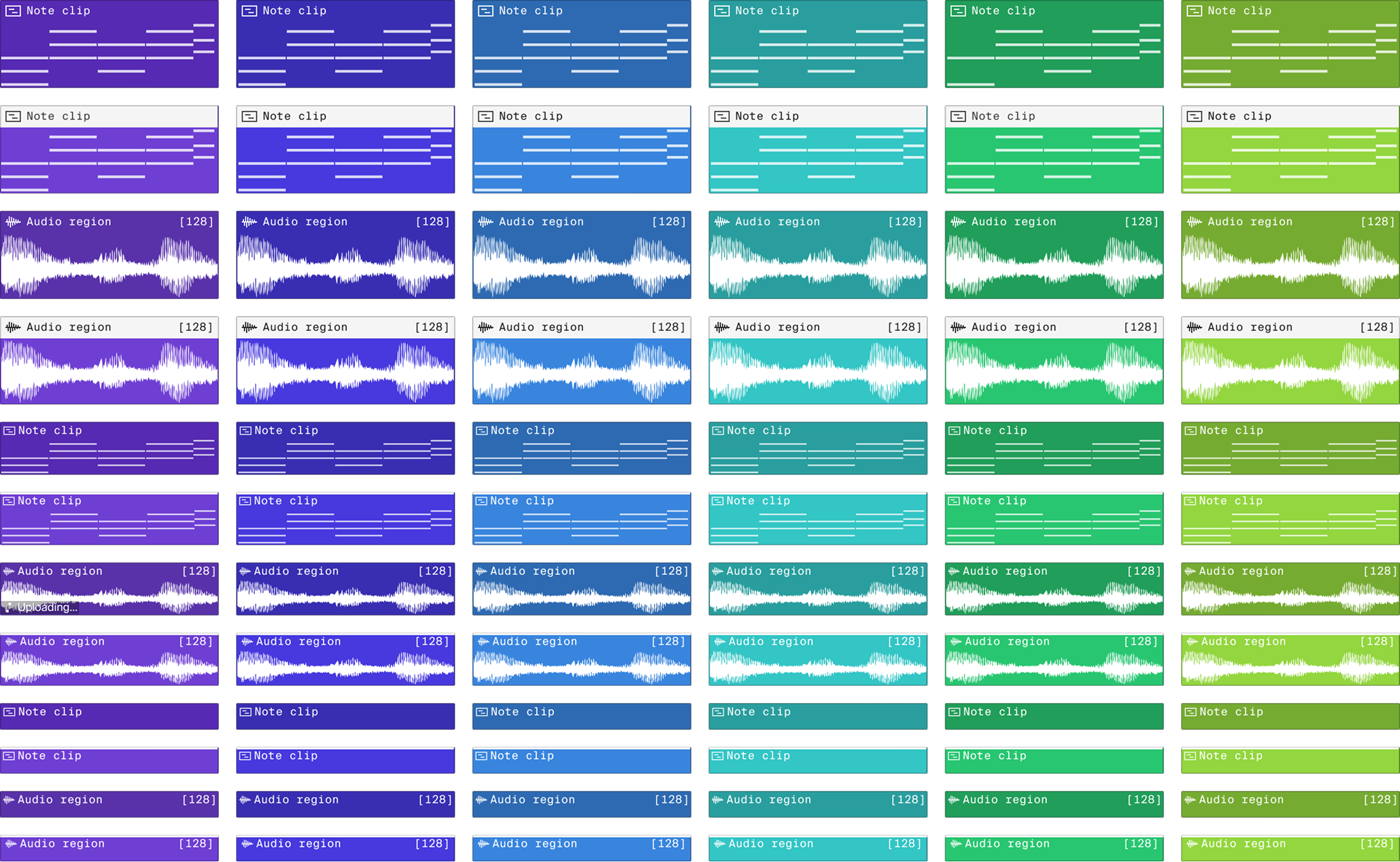
A part of the job included implementing, extending and modifying the design system and brand identity produced by the renowned agency Kurppa Hosk. Designing responsive, dynamic and complex components for many different states, view settings and zoom levels was a fun part of the work at Soundation.
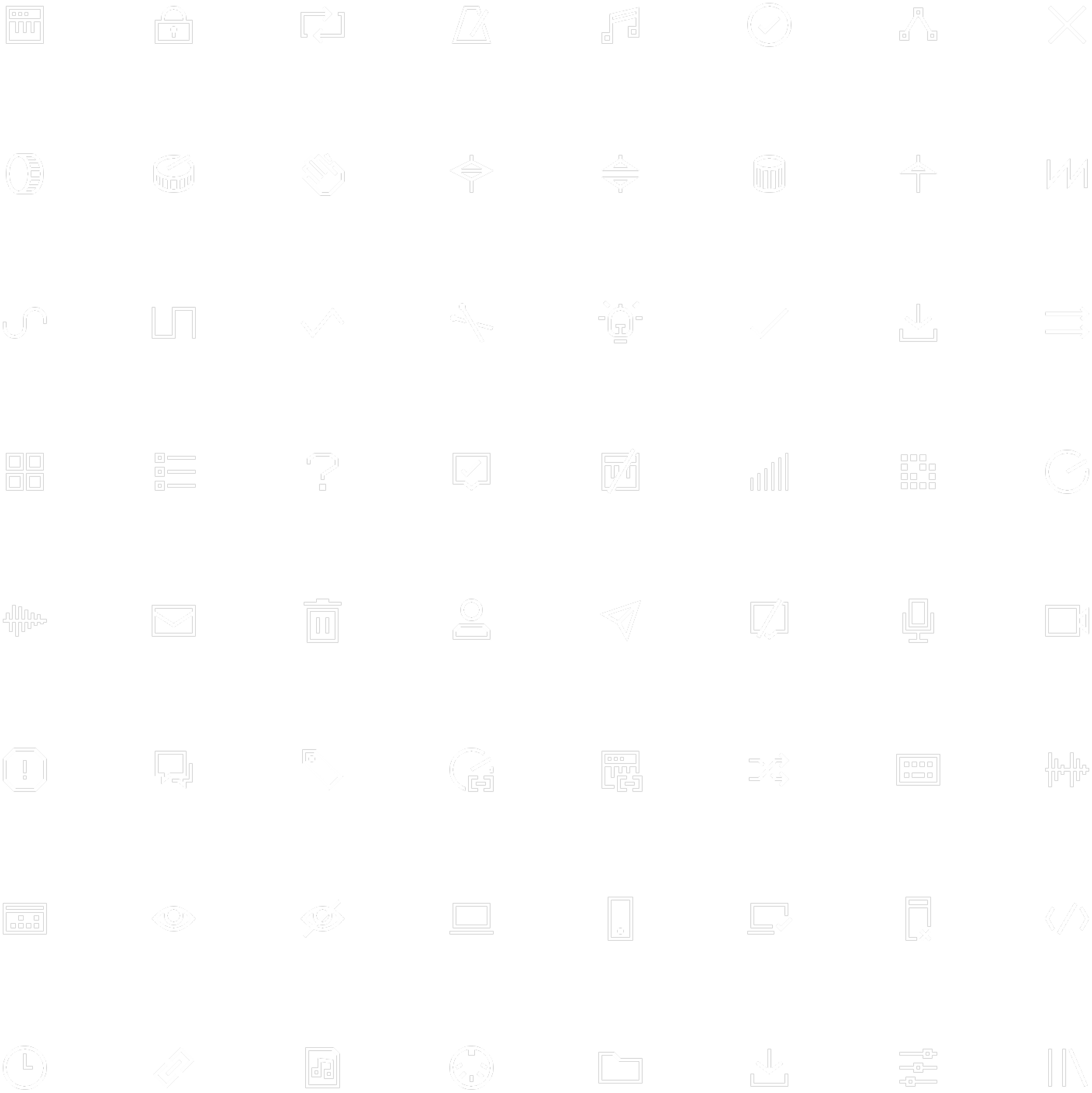
I take pride in implementing design DNA even in the smallest atoms of a design, by crafting icons in line with the brand identity. In this case it was a sharp style. Curious details; most may see a light bulb, but some may see an analogue amplifier tube. Automation icon in the shape of an “A” and beatmaker icon as “B” serves as functional quirky symbols for the brand DNA.